Conversion
How to Design a High-Converting Homepage (2026 Guide)
By Marcus Tan · 2026-06-24 · 9 min read
Your homepage is the hardest-working page on your website — and for most businesses, it quietly leaks customers. A high-converting homepage doesn't just look good; it guides the right visitor to take action in seconds. Beautiful design that doesn't convert is just an expensive brochure.
The problem is almost never the visuals. It's that the page makes visitors work to understand what you do, who it's for, and why they should care. Attention is the scarcest thing on the internet, and most homepages spend it describing the company instead of earning the click.
This guide breaks down the conversion-focused web design framework we use to turn homepage traffic into leads and sales.
What makes a homepage high-converting?
A high-converting homepage does three things quickly: it states a clear promise, backs it up with proof, and points to a single obvious next step. Everything else is supporting detail. If a section doesn't move the visitor closer to that action, it's decoration — and decoration costs you conversions.
It helps to be precise about what "converting" means here. For most businesses the homepage's job is not to close a sale. It's to get the right person to the next step — a quote request, a booking, a demo — and to get the wrong person to leave quickly, without wasting your time or theirs. A page that filters well is doing its job even when it says no.
Say what you do in five seconds
Open your homepage and start a timer. If a first-time visitor can't answer "what is this and is it for me?" in five seconds, the design has already failed — no matter how polished it looks.
Your headline isn't the place for clever wordplay. It's the place for a clear promise:
The best headline isn't the most creative one. It's the one a stranger understands instantly.
Lead with the outcome you deliver, not the mechanism. "Websites that turn visitors into customers" beats "Pixel-perfect design systems" every time. This is the single biggest lever in conversion-focused web design.
The reliable test is to show your hero section to someone outside your industry — a friend, a family member — for five seconds, then take it away and ask them what you sell and who for. If they can't say, the problem is not that they weren't paying attention. Everything below the hero is written for people who already understood the hero. If the hero fails, nothing below it gets read.
Three headline traps worth naming, because almost every underperforming homepage has at least one:
- The abstraction. "Empowering businesses to reach their potential." True of literally every company that has ever existed.
- The inside joke. A clever line that only makes sense once you already know what the company does.
- The feature list. Describing the mechanism before the visitor has any reason to care what it's a mechanism for.
Build a conversion-focused page structure
Every high-converting homepage moves the visitor through the same quiet funnel, top to bottom:
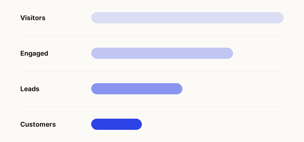
- Hook — a headline and sub-line that state the outcome.
- Proof — logos, results, or testimonials that make the promise credible.
- Mechanism — a short, scannable explanation of how it works.
- Objection handling — an FAQ that removes the last bit of doubt.
- Ask — one primary call to action, repeated.
The order matters more than the contents. Proof before mechanism, because nobody cares how it works until they believe it works. Objections before the ask, because a visitor with an unanswered worry doesn't convert — they "think about it," which means they leave.
It's also why the top of the page carries so much weight. Nielsen Norman Group's eye-tracking research found that users spend about 57% of their viewing time above the fold, and 74% within the first two screenfuls. People do scroll — the old "nothing below the fold gets seen" myth is dead — but attention drops off a cliff as they go. You don't get to save your best argument for later.
Layer in fast load times and clean, mobile-first design — Google indexes the mobile version of your site, not the desktop one — and you have a page built to rank and convert.
Make proof specific enough to be falsifiable
Proof is where most homepages get lazy. "Trusted by industry leaders" proves nothing. "We increased their inquiries by 60% in four months" proves something, because it's specific enough that it could be wrong — which is exactly what makes it believable.
The hierarchy of proof, from weakest to strongest:
- Claims about yourself. "We're passionate about quality." Worth nothing; everyone says it.
- Generic social proof. A wall of logos with no context. Weak, but better than nothing.
- Named testimonials. A real person, a real company, a real photo. Now we're getting somewhere.
- Specific outcomes. Numbers, timeframes, before-and-after. This is what actually moves people.
If you don't have numbers yet, don't invent them — borrow credibility instead. Show the work. Show the process. Show a real client saying a real sentence in their own words, typos and all. Authenticity converts better than polish, and it has the advantage of being true.
Commit to one primary call to action
The fastest way to lower conversion is to offer five things to do. "Book a call," "download the guide," "read the blog," "follow us," and "see pricing" all competing in the hero means the visitor picks the easiest option: leaving.
Pick one primary call to action per page and make it unmistakable. Everything else is secondary — styled quieter and placed lower.
Two details that matter more than people expect:
Match the ask to the temperature. A first-time visitor who has known you for eleven seconds is not going to "Book a 60-minute strategy call." Lower the commitment and the conversion rate rises: "Get a free quote" asks for less than "Schedule a consultation," and gets more.
Repeat it. The same call to action should appear in the hero, after the proof, and at the foot of the page. People convert at different points depending on how much convincing they needed, and the worst possible moment to make someone scroll hunting for a button is the moment they've just decided to act.
Design for both B2B and B2C visitors
Conversion psychology shifts depending on who's buying. A B2C shopper often decides in one visit; a B2B buyer decides over weeks, in committee. Your homepage should match that buying behavior — see our full breakdown of B2B vs B2C web design for the specifics.
The practical consequence: a B2C homepage is optimized for momentum, so you remove every possible obstacle between wanting and buying. A B2B homepage is optimized for confidence, so you give your champion the material they need to argue your case internally when you're not in the room. Same craft, opposite emphasis.
Measure, then improve
Design opinions are cheap. Behavior is truth. Before you redesign anything, instrument the page and watch what real visitors do:
// The three questions every homepage should answer with data
// 1. How far down do people scroll before they leave?
// 2. Which CTA actually gets clicked?
// 3. Where does the cursor hesitate?
Scroll depth tells you where attention dies — and, consistent with the eye-tracking research above, it's almost always higher up the page than you'd like. Click data tells you which of your carefully-crafted calls to action people actually use, which is frequently not the one you designed the page around. And hesitation tells you where the copy is unclear.
Fix what the data says, not what the loudest person in the meeting says. Then change one thing at a time, or you'll never know which change worked.
And the best homepages don't just inform — they often do something, like booking or quoting on the spot. See when your website should work like software.
Common questions
How long should a homepage be?
As long as it takes to answer the questions a buyer has, and not one section longer. Short homepages work for simple, familiar offers where the buyer already knows what they want. Long ones work for expensive or unfamiliar purchases, where every scroll is another objection handled. The failure isn't length — it's padding, and a visitor can smell it immediately.
Should the homepage or a landing page get my ad traffic?
A landing page, nearly always. Ad traffic arrives with a specific expectation set by the ad, and a landing page can answer exactly that with one path and no navigation. Your homepage has to serve everyone at once, which makes it the wrong tool for a visitor who arrived with one question.
How do I know if my homepage is underperforming?
Compare its conversion rate to itself over time rather than to an industry benchmark — benchmarks are collected from businesses with different traffic and different offers, and they'll mislead you. The stronger signals are behavioral: high traffic and low inquiries, most visitors leaving before the first scroll, or inquiries arriving from people who clearly misunderstood what you sell. That last one means the page is attracting, but not filtering.
Does design or copy matter more for conversion?
Copy decides whether they act; design decides whether they trust you enough to read the copy. In practice they fail together — an unclear page usually looks unconvincing too. If forced to choose, fix the headline first: it's the cheapest change on the page and the one with the largest effect. Then fix the design details that make a business look credible.
How often should I redesign my homepage?
Rarely, and never on a schedule. Full redesigns tend to throw away accumulated learning and reset your conversion rate to unknown. Continuous small improvements — a clearer headline, better proof, a lower-friction call to action — compound. Redesign when the business has genuinely changed, not when you've grown bored of looking at it.
A homepage's job isn't to impress. It's to move the right person one step closer to working with you — then get out of the way. If yours isn't pulling its weight, get a free website review and quote and we'll show you exactly where it's losing customers.